Clear
Care.
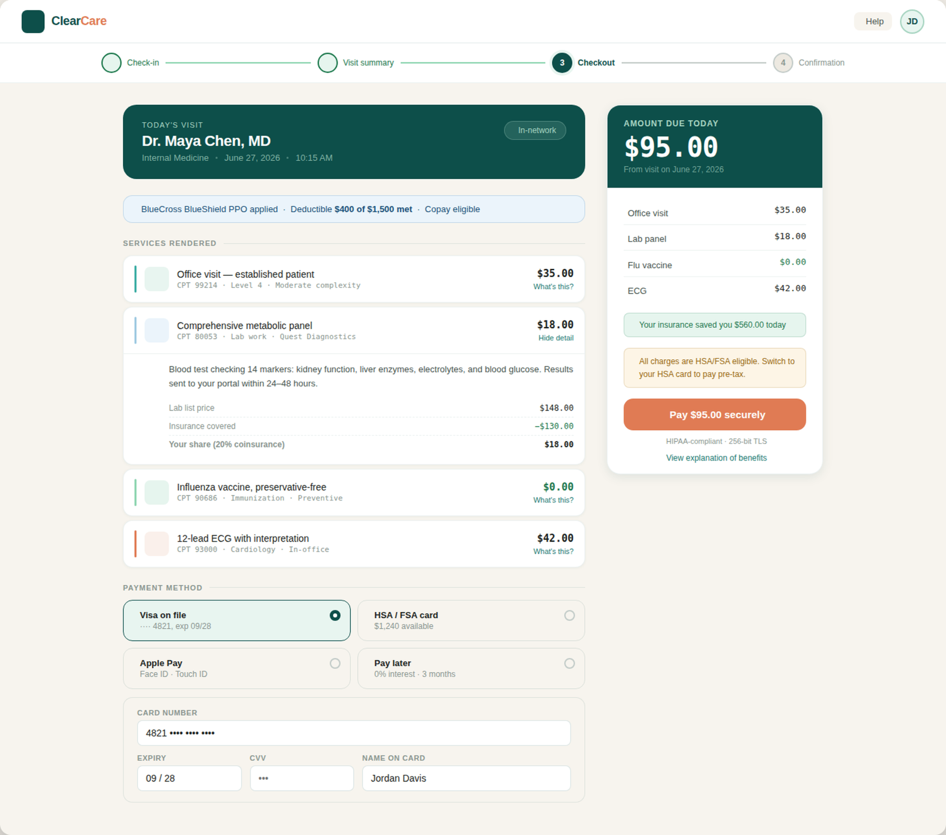
I designed ClearCare to turn confusing medical billing into a transparent, patient-first checkout experience. I focused on replacing jargon with plain language, surfacing insurance clarity at every step, and giving patients the tools to understand their costs and set up payment plans — all without picking up the phone.
- Role
- UX/UI Designer
- Timeline
- 1 Week
- Focus
- Patient Experience
01 — The Problem
Patients don't understand their medical bills or how to pay them.
Patients receive bills with little to no information or confusing medical terminology, leaving them unsure what they're being charged for, what insurance covered, or how they can pay.
Confusing Medical Jargon
Line items show CPT codes and clinical terminology with no explanation of what the service actually was or why it was needed.
Insurance Confusion
Patients can't tell what insurance covered, what went toward their deductible, or why they owe what they owe.
No Cost Transparency
List prices, adjustments, and patient responsibility are scattered or missing, so patients have to guess what they actually owe.
Payment Plan Hassle
Setting up a payment plan means calling a billing department, waiting on hold, and talking to a rep — there's no self-serve option.
02 — My Approach
I approached this by thinking about how patients actually experience billing.
I mapped the patient journey from check-in to confirmation, then redesigned every step around clarity, education, and giving patients control.
01
Discover
I reviewed real EOBs and patient billing complaints to see where the confusion was coming from.
02
Define
I identified the main friction points: jargon, unclear insurance info, missing cost breakdowns, and the hassle of setting up payment plans.
03
Structure
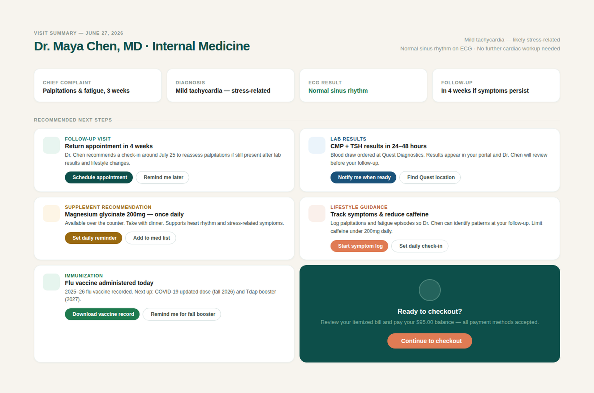
I designed a four-step flow — Check-in, Visit Summary, Checkout, Confirmation — built around an itemized receipt model.
04
Design
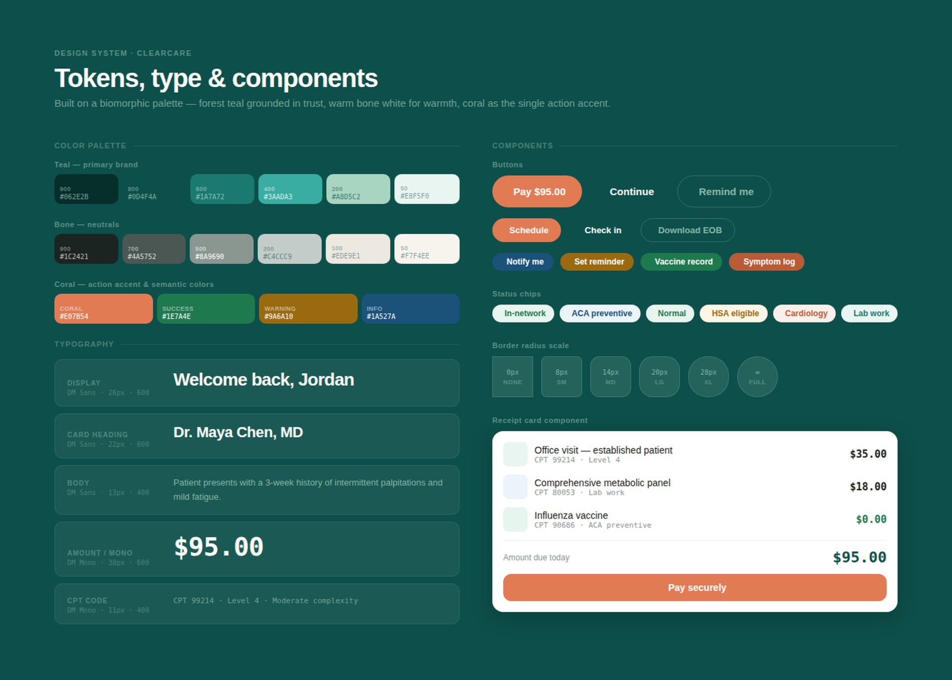
I created a calm, approachable system using forest teal and warm bone with coral as the single action accent.
05
Validate
I tested the copy, math, and self-serve flows to make sure patients could understand everything without calling.
03 — The Features
A checkout experience that informs patients instead of just billing them.
- Itemized Checkout
- Billing Transparency
- Visit Summary
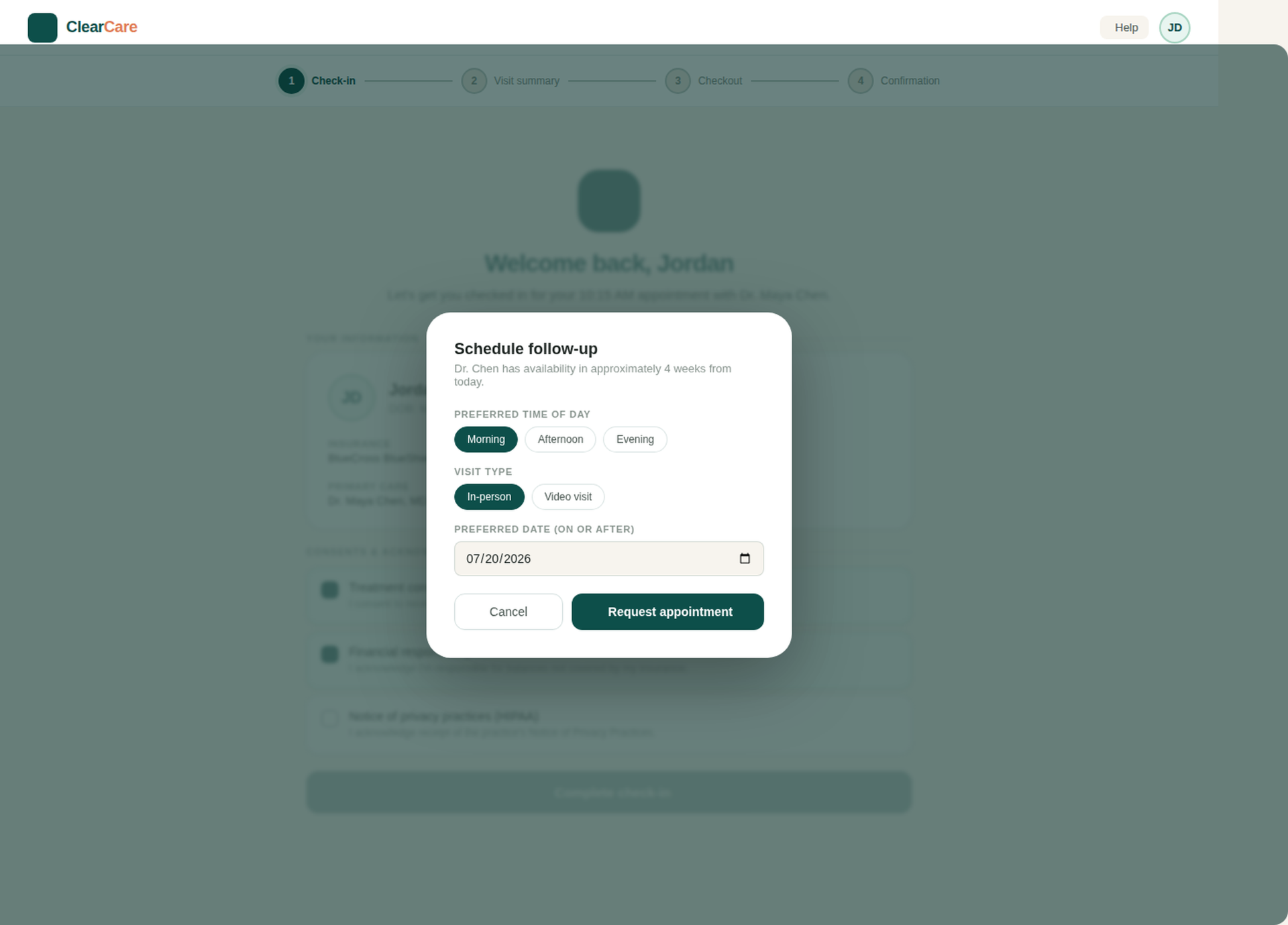
- Self-Serve Check-in
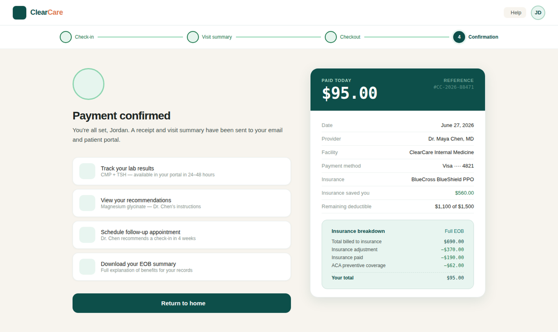
- Payment Confirmation
- Design System
04 — Design Decisions
Every decision was intentional and designed around what patients need.
Plain-English First
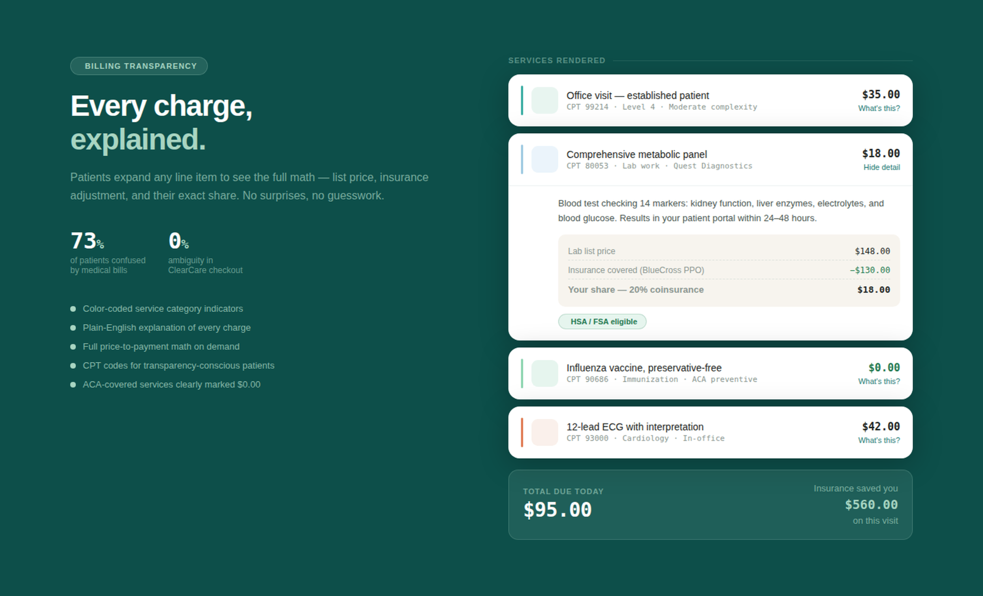
Every CPT code has a human description so patients understand the service, not just the code.
Show the Math
List price, insurance adjustment, and patient share are visible on demand — nothing is hidden.
Single Action Accent
Coral is only used for the primary action on each screen, so patients always know what to do next.
Self-Serve Payment Plans
0% interest plans are shown right at checkout, so patients don't have to call to find out their options.
Insurance Made Clear
Coverage summaries, deductible progress, and ACA-covered $0.00 items are called out clearly on every screen.
Trust Cues at Payment
HIPAA compliance and TLS encryption are shown near payment to reduce hesitation at the moment of action.
05 — Reflection
What I learned from this project.
Clarity Is Care
In healthcare, an unclear bill doesn't just frustrate patients — it erodes trust in the provider. Transparent billing is part of the patient experience.
Patients Want Control
When self-serve options like payment plans are easy to find, patients act faster and call less. Having control reduces anxiety.
Jargon Is a UX Problem
Treating medical terminology like an accessibility issue — not just something patients should know — changed how I approached every copy decision.
Calm Beats Clinical
A warm, approachable palette feels caring instead of sterile. In healthcare, trust is communicated visually as much as verbally.
Next case
AI-Native Product · 2026