Level Up
Clean.
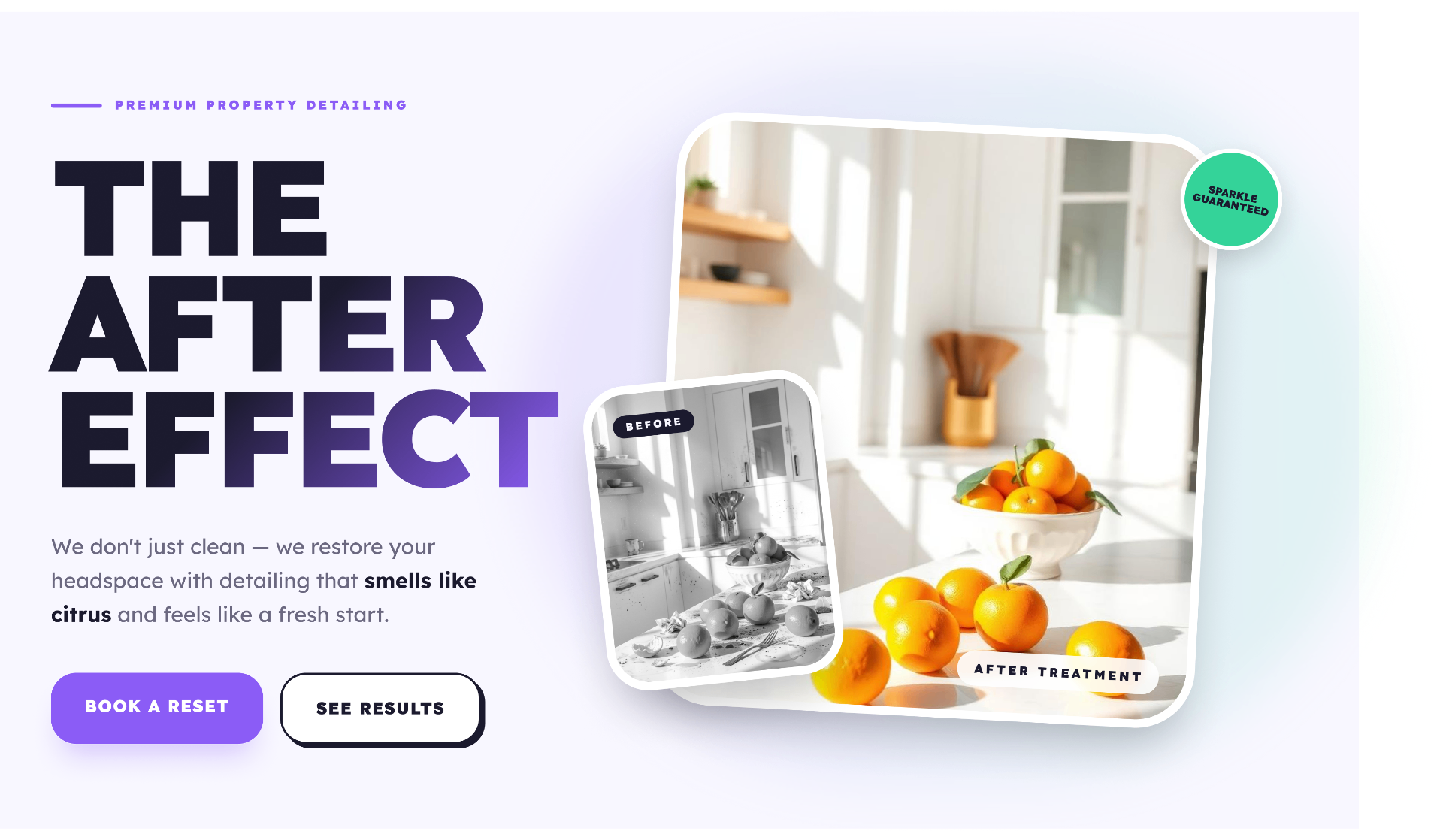
Level Up Clean is a landing page concept for a local cleaning company that didn't have a web presence. The brand is positioned around restoration — "The After Effect" — with citrus and fresh-start metaphors and a sparkle-guaranteed promise.
- Role
- Brand & UX Designer
- Timeline
- 1 Week
- Focus
- Brand & Landing Page
01 — The Problem
A trusted local cleaner with no way for new customers to find them.
Level Up Clean ran on word of mouth and texts. Without a site, every new lead meant a phone call, and there was no way to show the quality of the work before the first visit.
No Online Presence
Customers couldn't find services, pricing, or proof of work before reaching out.
Inconsistent Brand
Logo, voice, and visuals were ad hoc across socials with no through-line.
Manual Scheduling
Every booking ran through phone tag with no clear service tiers or expectations.
No Proof of Work
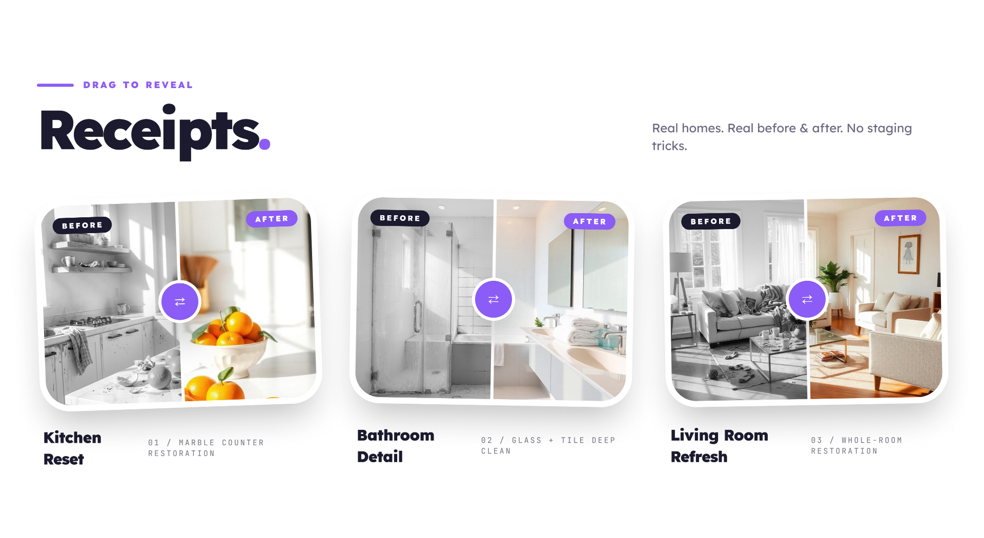
Before-and-after results lived in camera rolls, not in front of the next potential customer.
02 — My Approach
Design the brand and the funnel at the same time.
I built the brand voice — "The After Effect" — around restoration, then designed a landing page that lets new customers feel the result before they book.
01
Discover
Talked through the owner's services, ideal customer, and what makes the work different.
02
Define
Positioned the brand around restoration and a 'Sparkle Guaranteed' promise.
03
Structure
Mapped the page around proof — receipts, stats, and outcomes before the CTA.
04
Design
Built a soft lavender system with bold display type and a mint accent.
05
Validate
Walked the owner through the flow and refined services and CTAs based on real bookings.
03 — The Features
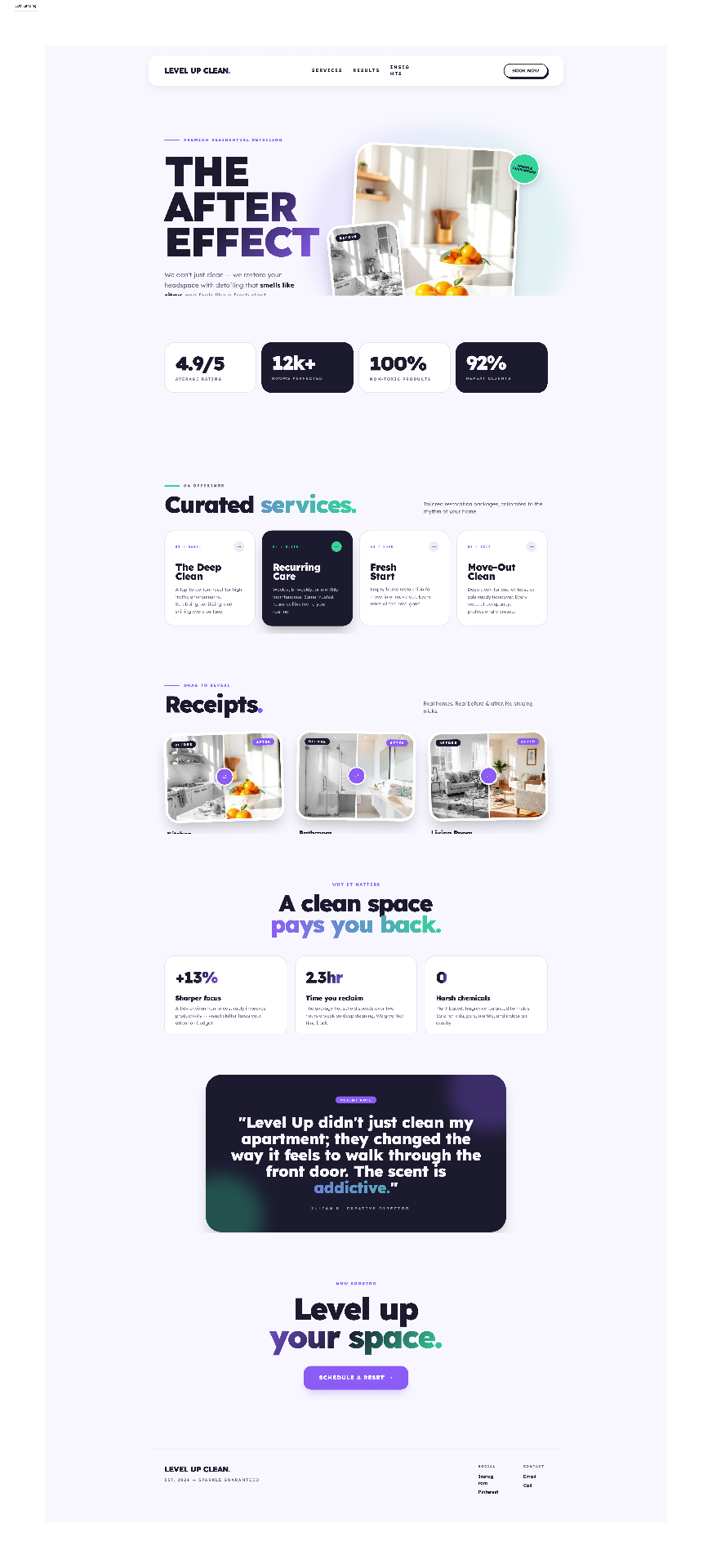
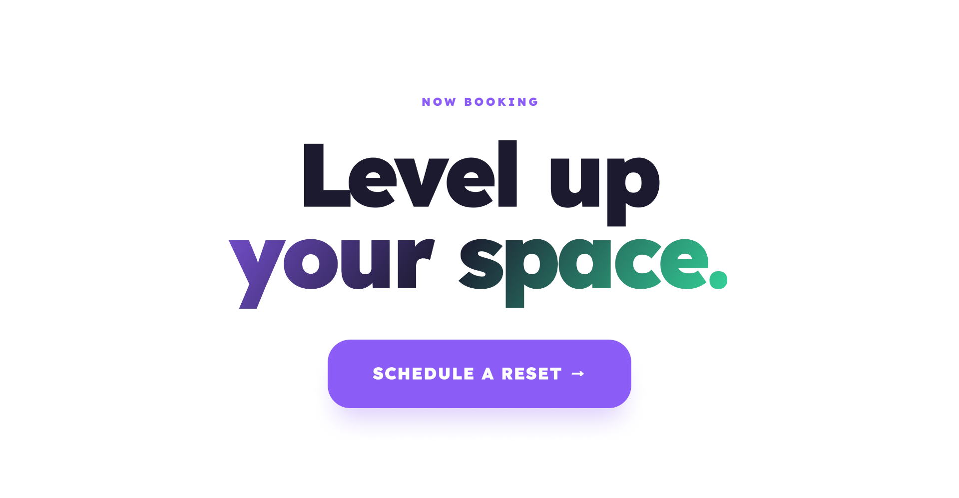
A landing page designed to feel like the after, not the before.
- Hero
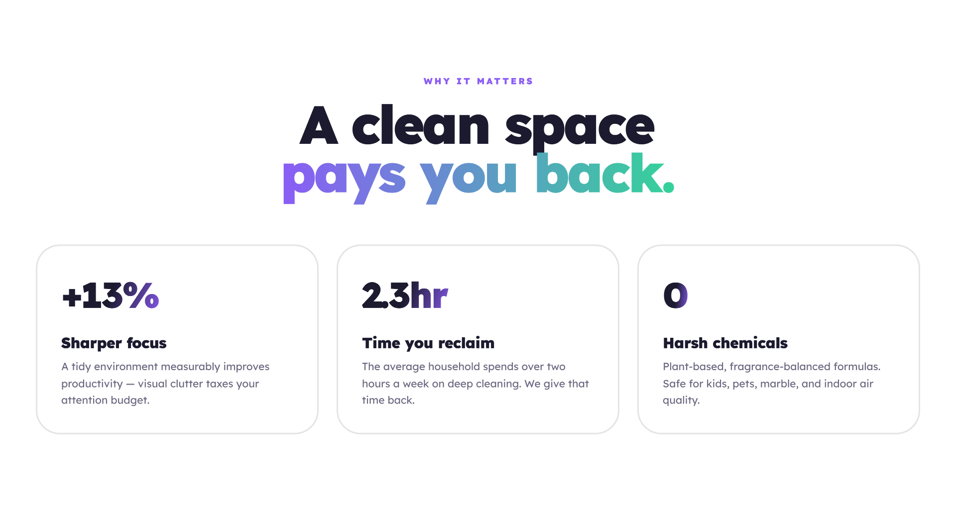
- Stats Strip
- Curated Services
- Receipts
- Schedule CTA
04 — Design Decisions
Every decision was made to feel like a brand, not a flyer.
Restoration, Not Cleaning
Positioning around the after-effect makes the work feel like an upgrade, not a chore.
Proof Before Pitch
Stats and before/after receipts earn trust before any CTA appears.
One Clear Path
A single primary action — Schedule — removes decision fatigue.
Bold, Soft, Specific
Soft lavender background, bold display type, mint accent — distinctive at a glance.
Local Voice
Copy reads like a person who shows up on time, not a national franchise.
05 — Reflection
What I learned from this project.
Brand Is the Funnel
For a small local business, the brand and the conversion path are the same thing.
Show, Then Tell
Before/after receipts converted intent better than any headline ever could.
Constraints Sharpen Voice
One page forced every word to earn its spot.
Design for the Owner Too
If the owner can't proudly send the link in a text, the design hasn't done its job.
Next case
Field Ops · 2023